
The sameness problem
Open ten SaaS products from the last five years and put their dashboards side by side. Most of them look like cousins — the same Inter typeface, the same cool grey palette, the same blue primary button. Safe and memorable are different things.
Finding our palette
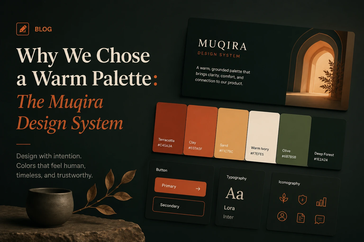
We landed on warm off-whites for light mode and a deep navy for dark mode. The navy has a faint warmth to it. It's closer to the colour of a well-worn hardback book than to a terminal screen.
“Warm neutrals feel more human. Users can't usually name the difference, but they notice when something feels cold.”
Typography choices
The decision to use a serif for display type was the most debated one we made. What changed our minds was seeing Cormorant Garamond at 80px. At that size it has a weight and confidence that no sans-serif we tried could match.
Tokens and themes
Every colour, shadow, and spacing value in the Muqira design system lives in a CSS custom property. When we switch themes, we remap those variables under a [data-theme] attribute on the HTML element. No JavaScript theme logic leaks into component files.
Living with the system
The best thing about a design system is that it makes decisions for you. When a new screen needs to be built, the palette is already chosen, the type scale is already set, the spacing increments are already defined.
Enjoyed this article?
Get new articles, product updates and insights from Muqira in your inbox.
Found this useful? Share it.